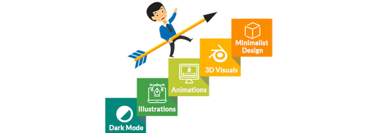
web design trends
With the massive rise of web design trends are constantly changing. In 2020, the technical possibilities seem to be endless and we’ve witnessed designers are crafting seamless designs, reinvent previous styles and continuous experiments with new techniques. Although, some popular styles just won’t get ahead such as the ever-present minimalism and colorful flat illustrations that have been present for a certain time duration.
So, what will the web design trends 2020 be? If you want to distinguish the latest trends early on what you’ll need help from your professionals.
Web Design Trends 2020
Here are the biggest web design trends 2020 will see:

-
Using Dark Mode
Dark mode web designs not only seem to be extremely modern, but they’re easy on the eyes and make colors and design elements are popular in the market segment.
Sometimes the most eye-catching web design trends have some practicalities, dark themes are much better for OLED screens saves power and extends screen lifespans but that utility doesn’t stop them from looking much better and attractive in terms of performance, complexity and design patterns. Likewise, dark backgrounds enhances the visibility of other accent colors for most of the well-defined dynamic designs focusing on web design trends 2020 to promote your patterns based on their preferences.
Get responsive website for your business now.
-
Brutally Designed Artistic Illustrations
Artistic Illustrations seem to be a particular element with line-shaped drawing and animations are enduring to rise in popularity. This website design trend seems to have gained tractions because it looks and seems to be authentic, unforced, and a bit imaginative of the notion web design trends 2020.
Absurd Designs demonstrates this with a collection of artistic elements that are quite imaginative, creative, and a bit determined. Seemingly, every illustration seems to look like it was depicted on the screen.
See how we can help you with our WordPress development services
-
Liquid-Enabled Animation
Every website you visit seems to incorporate certain forms of animation. What seems to be trending is considered as liquid-style animation with movement that appears to be a water lifespan.
Moreover, Liquid animation can correspondingly work for overall patterns as a way to transform video elements as a hover state to get more clicks, or as a general animation, the helps you towards the enticement users into the website design. The tricks to making this trend works are in the massive of the movement. It has been smooth, fluid, and perfectly timed for the most realistic feel and alluring form.
Most of the leading companies use liquid animation as a hover state to bring additional motions to elements on the screen. The background video uses “liquifies” and fixes the entire block of text. Liquid animation for the headline of his portfolio website, the words float on the screen and have an extra hover state that moves his image and the words can be even more in quantity to capture better insights of web design trends 2020.
Check our Beginners Guide: 6 Phases of Website Development Process?
-
Implementation of 3D Visuals
Incorporating depth creates a greater intellect of realism for web design. 3D imagery and visuals are extended insights into a particular idea. It is generally a trend we’ll witness to see a lot of near the end of the decade, and expect to see a lot more in 2020.
Cutting Edge 3D designs provide users something a little surprising, like the mask that breaks apart on the Metaconf Meetup site or the sideways scroll for tiny shoes on the Toke site.
Be sure to read Beginners Guide: How to Embed WordPress Blog into Website?
-
Ultra minimalist design
With the rise of wearable devices including smartwatches, web design in general order seems to be in the smaller order. The most affected area by this is known as navigation, the glue that collaborates with a website. With the past few years, navigation has been getting much simpler and smooth to accommodate extremely small devices and even smaller attention-seeking spans.
Extremely minimalist navigation draws away much of the difficulty in usability metrics. The less a user has to think about moving around, the more time that has been spent immersed in the site, actually moving around instead of wondering how to know about the particular form.
See How to Build a Website Development Project Plan: Step by Step Guide?
At the same point, imagery and 3D visuals are becoming an essential element of aesthetics designs. Large-scale photos and videos are your chances to motivate users while only using the bare minimum amount of text. Having less amount of text on the page large images are being pulled to the foreground and highlight the main focus of the alignment, keeping into consideration the next generation web design 2020. This is because the image gets an extension share of attention, you must always make sure it’s trustworthy, use powerful and artful visuals says all about it, based on their preferences in terms of design perspective.
Is it really hard for to follow everything, let us handle the hurdles. See our web development services

 +1 647 936 6616

